Stand out from your competitors with our professional plumbing graphic design services.
If you think that your plumbing business can survive without using compelling communication strategies, think again. As a plumber, you will need in one way or another other to visually communicate your service features, differentiators, and benefits to your target clients and prospects. According to research, more than 90% of information transmitted in our brains is visual so your plumbing company needs a great design to convey its purpose. Professional plumbing graphic design services play a major role in the modern marketing environment and create a competitive advantage for plumbers.
One of the most crucial elements of a successful plumbing brand strategy is creating the right graphics or images. The importance of graphic design for plumbers cannot be underscored, and that’s why so many plumbers have graphic designers and artists helping them to create a wide range of marketing collaterals for their brand. Before we dive into the advantages and types of plumbing company graphics, let us begin with the basics.
What is Plumbing Graphic Design?
Graphic design for plumbers is the process of developing visual concepts to impact ideas. The role of a plumbing graphic designer is to utilize images, text, color, typography, and space to create signals that help to connect with the viewer’s mind than using words alone. They are designers who balance between function and aesthetics to convey a customer’s intended brand message.
While they say a picture is more than one thousand, professional plumbing graphic designs can be worth thousands of dollars in your company. Graphic design is beyond just aesthetics – It is a mode of communication between your target audience and your plumbing business. Plumbers can use graphics in each stage of their marketing funnel to engage, inform and eventually convince to schedule a service appointment or take the desired action. Read on to understand the importance of plumbing graphic design in internet marketing.
5 Reasons Why Plumbing Graphic Design is Crucial in Your Business
As a plumber, you cannot run a successful local service business online without paying attention to internet marketing. Internet marketing has become a prerequisite in every plumbing business or marketer’s arsenal. Plumbing graphic design services operate as a fuel that ignites your marketing activities for your business to reach out to people and grab their attention.
Without further ado, let us discuss the five reasons why graphic design is crucial for any plumbing business (including yours) to make more profit and expand brand reach.
Plumbing Graphic Design Helps to Create a Powerful First Impression
It is clear that there is a lot of stiff competition among plumbers of all scales, regardless of the services they offer. To withstand this competition and get your fair share of the existing market, you should try to create a powerful initial impression for prospects or clients. Such impressions assist clients to remember your services and consequently your brand.
Graphic design is a crucial tool to assist any plumbing business to create a lasting, positive impression. The first time a prospect interacts with your business sets the tone for all the relationships you will build later on.
And normally, that initial interaction comes in form of plumbing visual marketing materials. This could be a brand new landing page on your plumbing website, a social media post, a flyer, a poster, and more.
Capitalize on the initial stage of the client’s buying journey by using updated, relevant graphics that tell the story of your plumbing brand. The impressive graphic design demonstrates your plumbing company principles and assists in creating a powerful initial impression in the minds of repeat clients and prospects.
Plumbing Graphic Design Helps to Build Your Brand Identity
Graphic design also assists in creating a strong visual brand identity, which is a really crucial aspect to help your plumbing marketing campaign. The best example of a strong plumbing brand identity is your company logo. Your plumbing company logo design is the primary link that connects your company with potential clients. That’s many plumbers are always craving a powerful, high-quality logo. And, that one aspect is sufficient to explain the essence of plumbing graphic design for your company, isn’t it?
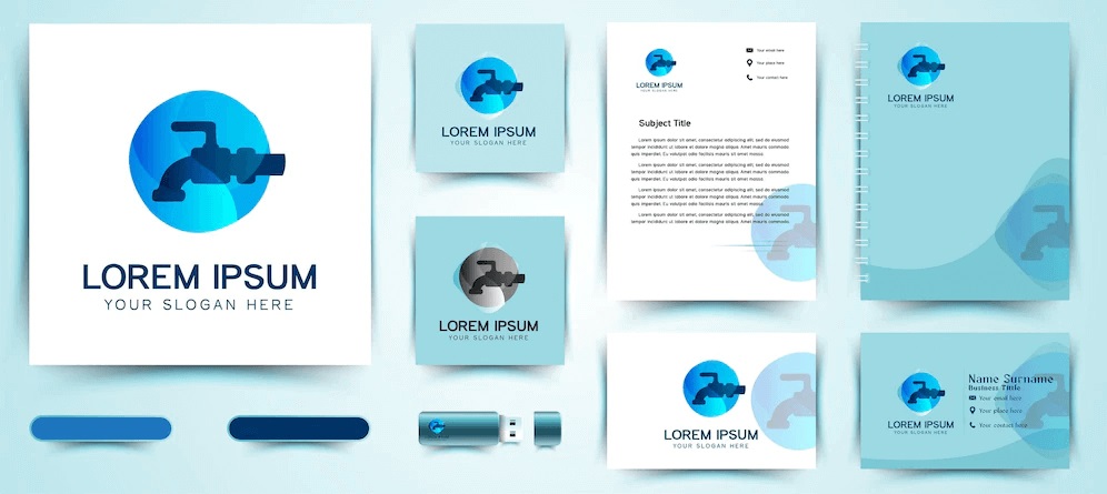
Your plumbing company logo is used in each aspect of your business communications, from the stationery, and adverts to your plumbing website. All of them assist in creating a vibrant brand identity for your plumbing business, and this provides an instant connection between your business values and the services offered.
Professional Image
The use of common graphics, images, and logos in your plumbing marketing collaterals, on your social media pages and website, can assist in creating uniformity and consistency. This uniformity and consistency project a professional image of your plumbing company to the target audience.
All the graphic design related to your plumbing business (including business cards, logos, leaflets, and more) is a crucial sign of your professionalism. A professional appearance distinguishes your business, and services from other plumbers online, helping you to get new clients and encouraging existing ones to stick with your plumbing services.
Building Goodwill and Trust
Plumbing graphic design helps to project a professional brand image. This professional image assists in establishing goodwill and trust in the minds of prospects or clients. Establishing such a trust helps in persuading buyers about the quality of the plumbing services offered.
Plumbers who have managed to establish strong goodwill for years are the ones who thrive in the long run. Professional graphic design for plumbers is important in establishing effective communication which can help to build credibility and trust.
Plumbing Graphic Design Gives Your Business an Edge Over the Competition
In the modern competitive marketplace, it is crucial to ensure that your plumbing brand stands out. One of the most effective ways of doing this is by customizing your plumbing marketing materials so that they remain unique to your brand.
When your business has a visual brand identity that is different from other plumbers in your area, it makes you memorable and offers you an advantage over your competitors. Prospects or clients are likely to remember a visually distinct plumbing brand, which implies they are most likely to build a top-in-mind awareness around your business. This makes it easier for you to encourage them to convert.
3 Types of Plumbing Graphic Design You Need to Know
Graphic design has different kinds of specializations, and all of these specializations have one primary goal: to organize and communicate information to a user. By using color, imagery, organization, and form, you can achieve effective and clear communication. If you are planning to hire a graphic design agency for your plumbing company, it’s crucial that you understand the different types of graphic designs for plumbers so that you can hire the right agency for the job.
1. Advertising Plumbing Graphic Design
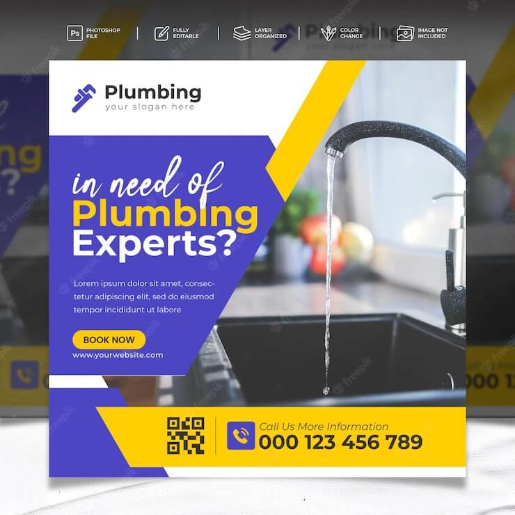
Advertising design is one of the most famous genres in the graphic design space. It deals with visual artwork in flyers, newspapers, magazines, email templates, brochures, and other marketing materials for promoting your plumbing services (both offline and online). This explains how the great plumbing marketing strategy reaches a whole new level to engage the target audience in terms of their unique requirements. You can contact a reliable and experienced plumbing graphic design agency to create impressive designs to grab your client’s mind.
Advertising graphic design for plumbers examples include:
- Digital advertisements
- Social media graphics
- Brochure design
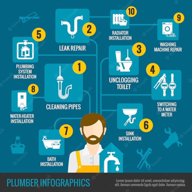
- Infographic design
- Email marketing templates
2. Visual Identity Plumbing Graphic Design
A plumbing brand represents the relationship between your business and its target market or audience. A brand identity is how your plumbing business communicates its tone, essence, and personality, as well as emotions, experiences, and memories. Visual identity plumbing graphic design is precisely that: the visual components of brand identity that act as the face of your brand to convey those intangible traits through shapes, color, and images.
Plumbing designers who specialize in visual graphic design work with plumbers to create marketing collaterals like color palettes, image libraries, typography, and logos that showcase your brand’s personality. Besides the normal business cards and stationery items, our plumbing graphic designers often create a set of visual plumbing guidelines (otherwise known as a brand book) that describes our best practices and offers examples of visual plumbing branding to be applied across all media. The brand book ensures that your business is consistent throughout future applications. Our visual identity graphic designers have excellent creative and conceptual skills and will create designs that will help your plumbing business outrank the competition.
Related: How to Rebrand Your Plumbing Business for Success
3. Environmental Plumbing Graphic Design
Environmental design is a broader type of graphic design that connects prospects or clients to places and discusses the story behind specific elements such as materials, typography, patterns, colors, and more. Some examples of environmental graphic design include office branding, signage, exhibitions, and more.
User Interface Graphic Design and Plumbing Website Design
Web and UI designers are responsible for developing websites and apps. Besides possessing a fundamental knowledge of graphic design, they also have to understand basic coding and user experience design.
Most of the projects here are based on websites, interfaces, landing pages, and marketing sites. They work together with a UX designer and UI developers that make apps function.
Publication Plumbing Graphic Design
Publication graphic design encompasses the design of things such as eBooks, brochures, reports, and newsletters. The designers here must create visually appealing designs that are readable and make sure that the information on every page is flowing well.
DIY Plumbing Graphic Design vs. Hiring a Professional Designer: Which One Is Better?
You may have nails and a hammer, but you cannot go ahead to build your own house. The same applies to plumbing graphic designs. Although there are tons of DIY graphic design tools available as an alternative to hiring a professional designer, your business’s image is nowhere you want to pinch your dollars. Professional plumbing graphic designers are trained to convey your brand message and bring credibility.
Here are our reasons why a plumbing graphic designer will benefit your company:
- Leverage the Designer’s Knowledge
Experienced and educated plumbing graphic designers have understood the fundamentals of design-they have learned to place emphasis where needed, know the symbolism and meaning behind colors, and can strategically put the key text and call to action. They can leverage their innate design prowess and education to help your design collaterals attain their desired effect among your target audience.
- A Professional Graphic Design Agency for Plumbers Saves You Stress and Time
Designing plumbing company graphics is not an easy task. It is meticulous, time-consuming, and thoughtful. Coming up with a quality graphic design for your plumbing business takes hours, which you already don’t have if you are managing your company. Hiring professional graphic designers reduces the stress brought about by trying to develop their own designs. DIY graphic design tools take a lot of time to fully comprehend and utilize effectively. Professional designers use these programs on a daily basis and are familiar with the functionalities and capabilities of each one, assisting for a quick turnaround than having to design your plumbing graphics yourself.
- Focus on Fine Details
A professional plumbing designer can push your graphics with their keen attention to detail. For instance, when working with typography, they choose their color, font, and line spacing based on the business’s overall readability and brand of the content. You want your brand message to be clear for your target audience to comprehend. A plumbing graphic design agency organizes and curates numerous design elements in a reader-friendly way across different platforms. For instance, projects that are online call for numerous design knowledge and techniques than those in print.
- Create a Unique Plumbing Brand
Buying ‘clipart and plumbing logos’ from the web imply that you are not creating your own visual identity. It could possibly imply that you are utilizing similar or the same images as your rivals. Standing out and building a brand that aligns with your plumbing company and values is crucial when establishing your brand, and hiring a professional designer can assist you to attain just this.
- Consistency is Key
The one important part of creating a memorable plumbing brand is matching and retaining every element of your plumbing marketing collateral from your site, posters, newsletter, brochures, and social media profiles. Creating a mixed match of colors, fonts, and images, designed by various people is committing a plumbing brand suicide. Trust your graphic design professional and know that they are designing from a place of some love.
Capture the Attention of Your Prospects with Quality Plumbing Graphic Designs from Blackstorm Design + Marketing Today
Have you ever come across a poorly designed plumbing logo or website? They make you feel unimpressed and intimated and maybe even disinterested. Poor plumbing graphic designs have the immense power to turn away clients without even them understanding why they don’t want to book jobs with your plumbing company.
However, great graphic designs can have the opposite effect on prospects. The only issue is that it takes years of experience to become an experienced graphic designer using software like Photoshop and Adobe Illustrator. That’s where our plumbing graphic design agency comes in …..all of our designers use Adobe Suite daily and can create most graphics with ease while you are repairing broken pipes or installing new ones.
Are you searching for personalized help to elevate your plumbing brand to grab the attention of your target audience?
We know that you have amazing plumbing talents and skills that can benefit your neighborhood. But now you require the brand identity to match that showcases your value and captivates your target market.
With many years of experience under our belt, Blackstorm Design + Marketing has a passion of transforming home service businesses like roofers or plumbers and giving company owners the confidence to showcase their brand and grow their business to its full potential with great plumbing graphic designs.
Our areas of expertise include:
Plumbing Logo and Brand Identity Development
Consistent and proper branding is important to a thriving plumbing business and brand recognition. Your plumbing company name, messaging, and logo are the key elements of your business’s brand identity. Successful plumbing brand development creates trust, improves recognition, and generates new clients. To keep everyone on board, we recommend you get a brand book that will help lay a good foundation for your branding activities.
The brand book guidelines outline how to effectively use the web, print, and logo design standards and may include tone, company messaging, and grammar. As a reputable plumbing graphic design agency, we create great plumbing brands from start to finish, and we develop clear brand guidelines that will set your business and brand for success in all its communications (both offline and online).
Related: Plumbing Logos Strategies for Plumbers Guide: Secrets of Outranking the Competition Revealed
Graphics for Your Plumbing Website
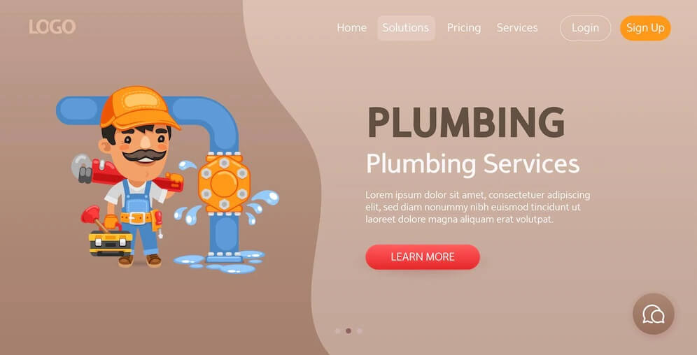
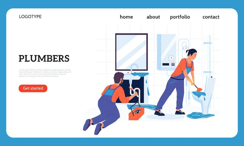
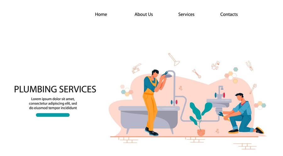
The quality of your responsive plumbing website is as good as the graphics you use. If you want to make your plumbing content more memorable and engaging, then you need to reexamine the graphic design of your site.
When it comes to your plumbing company website, prospects or clients are going to judge the quality by what they see on the homepage and whether it is aesthetically appealing sufficient for them to linger around to navigate the rest of your website’s content. With the average attention of most people reducing nowadays, most prospects won’t even bother scrolling if they come across a site that loads at a tortoise pace, let alone its poor design.
If you want your site browsers to remain engaged once they land on your plumbing website, then don’t skimp on the website’s design.
Graphics for Social Media Platforms
Social media is a great plumbing marketing tool at your disposal. If you want to grow your plumbing company online, then having professionally designed graphics on your social media profiles will assist you to get noticed by prospects or clients using these platforms.
Our talented graphic designer can develop custom profile images for your plumbing brand that will be recognizable across all screens and devices. They can also design graphics for social media posts and banners that are user-friendly and attention-grabbing.
The benefits of hiring a creative plumbing graphic design agency like Blackstorm Design + Marketing include increased brand awareness among your target market through better engagement, creative visuals, and more attractive plumbing brand profiles.
Graphics for Print Plumbing Marketing Collateral
Print plumbing marketing collateral refers to the tangible pieces of your branded materials. Every plumbing company should have a professional design of their printed marketing media files for brochures, postures, flyers, and more. A professional plumbing graphic design agency will produce a final result that looks professional and polished while still adhering to your brand book guidelines.
You want your prospects or clients to notice your plumber services as soon as they come across them in their physical mailbox or on the street. By hiring professional graphic designers, you can have all the printed pieces ready when you want to launch your next plumbing marketing campaign!
Proper File Handling Guaranteed
Do you know that your design files can fail to print if they are not properly stored? If you are designing business cards yourself, it is easy to assume that the whole design process is done. But when it comes to printing, most plumbing contractors don’t understand that it should be configured properly to avoid throwing your money down the drain.
On the flip side, digital files need special care and treatment too. Have you ever visited a plumbing website where the images were grainy and pixelated, or they took centuries to load? There are several reasons why such things happen. Real estate is particularly guilty of this.
All our professional graphics are optimized for the target medium. We use the top graphic design standards for color, formatting, compression, and more so that you don’t have to fret about a great graphic design for plumbers being ruined over a technicality.
Need Help with Plumbing Graphic Design?
Do you need a professional plumbing logo design? Do you want to outrank your competitors with an eye-catching plumbing brand identity? Need assistance creating your plumbing company marketing collaterals, website design, or print design? Our plumbing graphic design services are about making your plumbing business look professional.
If you need help with creating quality graphics for your plumbing business, schedule a free profit session with Blackstorm Design +Marketing to learn more about our plumbing graphic design services.


