You can have the most equipped practice packed with experienced and passionate healthcare professionals; however, if you fail to invest in a good website, you will deter a lot of potential patients from making their first and subsequent visits. We live in an age where patients turn to the internet before visiting healthcare establishments. A poorly designed website is, therefore, detrimental.
Your patients may visit your practice physically a few times a year; however, they have health concerns more often. Having a fully functional website allows them to get health-related information with ease. It also keeps them connected and loyal to your practice.
Here are some effective tips for improving the user experience on your practice’s website.
Have Legible Typography
Having a site packed with useful information is great for your practice. However, is the information easy to read? One of the most critical design aspects of any website is typography. Your content must be legible; otherwise, it won’t matter. According to CommunicateHealth Creative
Director, Molly McLeod, Sans Serif fonts are great for the web. She recommends a font size of 16 and above alongside a widget that is easy to use if you want to make text bigger. A line of text shouldn’t exceed 75 characters (approximately 15 words), and the line-height should be 140 percent+ to allow white space between every line. Paragraphs should be brief with spaces in between and headings and subheadings should be progressively smaller. Lastly, lists should be bulleted.
Include Call-To-Action
To boost user experience on your site, you need to make sure you maintain the attention of every patient that visits your site. To do this effectively, you must navigate them by using interesting and relevant Calls-To-Action. As the name suggests, a Call-To-Action prompts a website visitor to take specific action which can range from submitting their email address to signing up to receive newsletters or buying a product.
In addition to Call-To-Action buttons and links, you must organize your navigation tabs and make them engaging. Besides using interesting wording, the buttons and tabs should complement each other. The prompts should also be eye-catching. If a potential patient on your site doesn’t see or notice anything else while they are on your site, they should at least see or notice the Call-To-Action.
Ask for minimal information
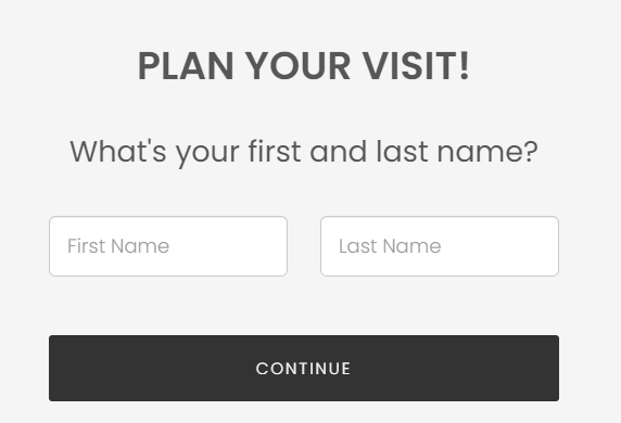
Although having Call-To-Action buttons like sign-up buttons is important, you should ask for minimal information to avoid “turning off” your site visitors. 67% of people spend 1 to 3 minutes filling out an online form. Experts recommend form designs that take a minute or less to fill and ask for minimal information such as names and email addresses. Long forms with complex information requests confuse, frustrate and/or annoy your site visitors. For a practice site, you should be extremely sensitive about the information you ask for and leave additional information requests optional.
Website Must Be Mobile Friendly
The latest 2019 mobile internet user penetration statistics show that 63.4% of people who access the internet globally do so via mobile devices. This statistic alone highlights the importance of having a website that works perfectly when viewed via Smartphones and tablets, among other internet-enabled mobile devices. Your practice website must be designed to look and work perfectly when accessed from any computing device with more emphasis on mobile-friendliness. Besides boosting engagement, a mobile-friendly website is good for SEO. The #1 search engine globally, Google, considers mobile-friendliness when ranking sites. Responsive sites have great functionality and loading times – important search engine ranking factors.
Create Engaging Content
You should have a blog to give your patients ample and important information on health and medical topics that might capture their interest. Your patients have no reason to keep coming back to your site if all you have is old basic information. A blog allows you to share expert information on a wide range of topics. However, stay away from complicated medical terminologies and use simple language instead.
Offer Help
Lastly, your practice website should have a help/FAQs section that offers help on common issues. You can use the inquiries you get to create a helpful FAQs section. Having real-time communication, i.e. phone numbers and Live Chat will also go a long way in offering instant help to potential patients looking to visit your practice for the 1st time or existing patients looking for additional information.


